「かわいい子には留学させよ」は、子どもを国際人に育てるために留学させるという考え方を表した言葉です。留学には、語学力やチャレンジ精神、コミュニケーション能力、広い視野、自分の意見を伝える力などを養う効果が期待できます。
留学のメリット
- 語学力やコミュニケーション能力の向上
- チャレンジ精神の養成
- 自分の意見を明確に伝える力や広い視野の獲得
- 国内外の友人関係の構築
留学の費用
- 語学留学の短期では、1週間で20万円~、4週間で35万円~、8週間で55万円~程度かかります。
- 長期では、1年間で200万~350万円程度かかります。
- 高校留学では、カナダ、オーストラリア、ニュージーランドの公立校が費用が抑えられ人気です。
留学におすすめの国ニュージーランド、アメリカ、 カナダ。
留学の受け入れ年齢
単身での留学の場合は、基本的にカナダは7歳、イギリスは8歳、アメリカ・オーストラリアは10歳、ニュージーランドは11歳から留学が受け入れられています。
Optimization for various types of devices and resolutions plays a fundamental role in modern website design. Web page layouts should be genuinely responsive and not rely on any fixed-size elements. Web designers using fluid grids and flexible images will guarantee that a web page will render well on a variety of devices, windows, and screen sizes.
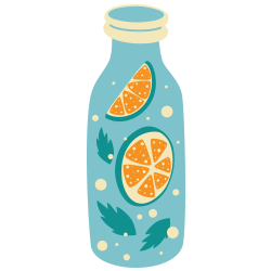
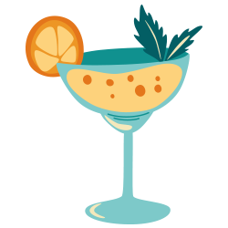
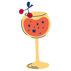
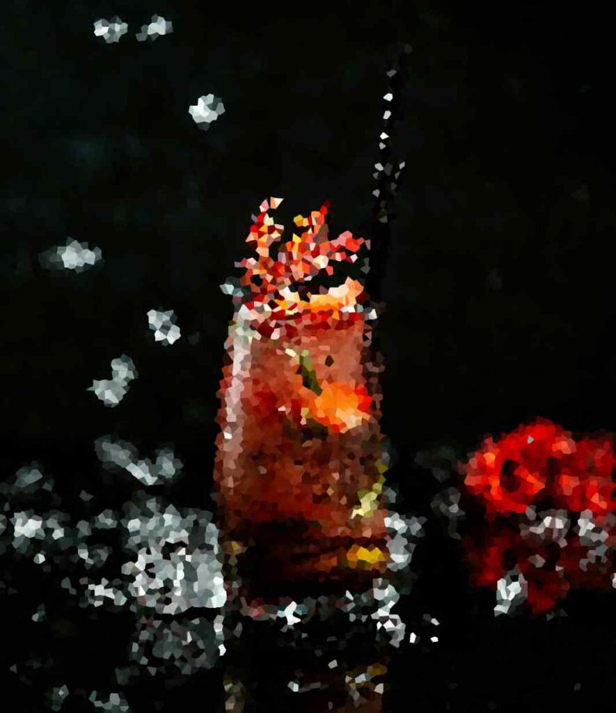
Tropical Sunrise Cooler
This Tropical Sunrise Cooler is perfect for hot summer days or anytime you need a refreshing pick-me-up. Feel free to adjust the ingredients to suit your taste preferences. Cheers! 🍍🌅🍹
- Pizza Peel
- Rolling Pin
- Pizza Cutter or scissors
- 1 pound pineapple juice
- 1/2 cup orange juice
- 8 ounces coconut water
- 2 tablespoon honey (adjust to taste)
- 1 Pineapple wedges and mint
- 2 tablespoons olive oil
- Ice cubes
In a shaker or large glass, combine the pineapple juice, orange juice, coconut water, lime juice, and honey.
Stir well until the honey is fully dissolved.
Fill another glass with ice cubes.
Pour the mixed juice over the ice cubes.
Stir gently to combine.
Garnish with a pineapple wedge and a sprig of mint, if desired.
Serve immediately and enjoy the tropical flavors!
Bask in the tantalizing flavors of the tropics with this vibrant and refreshing Tropical Sunrise Cooler. Imagine yourself lounging on a pristine beach, with the warm sun kissing your skin and the gentle sound of waves in the background. This drink is your ticket to a mini vacation, delivering a burst of tropical goodness with every sip.
Most users search for something interesting (or useful) and clickable; as soon as some candidates are found, users click. If the new page doesn’t meet users’ expectations, the back button is clicked and the search process is continued.
Food brings people together on many different levels. It’s nourishment of the soul and body; it’s truly love.
Giada De Laurentiis
A good website should be easy to navigate
Not all websites are made equal. Some websites are simple, logical, and easy to use. Others are a messy hodgepodge of pages and links.


Without website navigation, your visitors can’t figure out how to find your blog, your email signup page, your product listings, pricing, contact information, or help docs.
Website navigation allows visitors to flow from one page to another without frustration. If you’ve done your job well, visitors leave your site with the intention to return and might even buy something from you or sign up for your email list.
Bad navigation is an especially common problem. We’ve all struggled to find things on disorganized websites without any logical structure. It feels hopeless.
Using “complex large pictures”. Because a carousel generally carries a lot of picture messages, complex large pictures result in low performance and “slow loading rate” of the sites, especially those whose first homepages are occupied by high-resolution carousels.
Creating visual rhythms in your layouts
In design, rhythm is created by simply repeating elements in predictable patterns. This repetition is a natural thing that occurs everywhere in our world. As people, we are driven everyday by predictable, timed events.
One of the best ways to use repetition and rhythm in web design is in the site’s navigation menu. A consistent, easy-to-follow pattern—in color, layout, etc. Gives users an intuitive roadmap to everything you want to share on your site.
Rhythm also factors into the layout of content. For example, you “might have” blog articles, press releases, and events each follow their own certain layout pattern.
Elements that can help website visual composition
Nobody enjoys looking at an ugly web page. Garish colors, cluttered images and distracting animation can all turn customers “off” and send them shopping “somewhere else”. Basic composition rules to create more effective:
- Direct the Eye With Leading Lines
- Balance Out Your Elements
- Use Elements That Complement Each Other
- Be clear about your “focal points” and where you place them
The size and position of elements in a composition will determine its balance. An unbalanced design generates tension, which may be the goal in many design projects, but for web apps that demand repeated comfortable use, tension is not a desirable trait.
Diving into UX and UI design
UX and UI: Two terms that are often used interchangeably, but actually mean very different things. So what exactly is the difference?
Styles come and go. Good design is a language, not a style.
Massimo Vignelli
UX design refers to the term “user experience design”, while UI stands for “user interface design”. Both elements are crucial to a product and work closely together. But despite their relationship, the roles themselves are quite different.
Ensure that interactive elements are easy to identify
Good design guides the user by communicating purpose and priority. For that reason, every part of the design should be based on an “informed decision” rather than an arbitrary result of personal taste or the current trend.
Provide distinct styles for interactive elements, such as links and buttons, to make them easy to identify. For example, “change the appearance of links” on mouse hover, “keyboard focus”, and “touch-screen activation”.
Breaking down the barriers
Design is not the end-all solution to all of the worlds problems — but with the right thinking and application, it can definitely be a good beginning to start tackling them.